
Chlorofell
Role: UI/UX Designer
Type of Project: Team Game Project
Duration: August 2022 - April 2023
Software: Custom C++ Game Engine, Figma, Unity
Overview
Chlorofell was developed over the course of a full academic year, prototyped in Unity and built in a custom C++ engine. The game is an isometric top-down shooter centered on player mastery, featuring manual reloading and a variety of ammo types to deepen combat strategy. As the Level and UI/UX Designer, I collaborated closely with artists, programmers, audio designers, and fellow game designers to deliver the best possible game within academic and technical constraints. My contributions included creating the UI/UX style guide, designing wireframes, and implementing menus directly in the team's custom engine and editor.
Responsibilities
HUD Design
Menu Design
Menu implemetation in custom C++ engine
Production
Planning
Assisted the systems designer during pre-production by prototyping core mechanics.
Planning was done iteratively, focusing on how similar games communicated mechanics through UI.
Drew significant inspiration from SYNTHETIK 2, particularly its Active Reloading mechanic, which influenced the team’s manual reload system.
After pre-production, created a UI/UX style guide to support and align efforts across art, programming, audio, and design teams.
The style guide helped communicate design intentions and streamline collaboration throughout development.

©SYNTHETIK 2. (2021). Flow Fire Games UG
Chlorofell UI/UX Style Guide
The purpose of this guide was to provide the team with a resource to understand the UI's functionality and style.
Below is the style guide in its entirety.
First up was the “Assets” section — it laid out all the UI elements needed so the artists knew exactly what I was asking for, and could understand my thought process if they had feedback or changes.
Second was the “States” section for the programmers — I created it to provide clear gameplay events the UI should respond to.
I also used mind maps (pages 13–16) to make the different states super clear, and the programmers told me it helped them know what to do without constantly checking in.
Lastly, there was a “References” section for the artists to get a feel for the visual direction, such as how the icons, animations, and VFX should look.
Even though some reticle UI icons were already made, I still included assets, states, and reference art to help both programming and audio stay on the same page.
This guide includes:
Color Palette
Main Menu layout and design
For each UI HUD Element
Required Assets for functionality
Gameplay States
Art References
Main Menu
The starting portion of this guide is the out-of-gameplay menus. I worked with my UI artist to derive a color palette from our in-game environment art, ensuring continuity between the menus and the areas where the player is actively playing.
As part of making the main menu, I put together an eye progression diagram to show how players would naturally look at everything on screen.
I used my UI artist logo as an arrow to lead the eye toward the arted-out menu background.
From there, the idea was that the player’s attention would easily land on the buttons.

Intended user flow for the main menu:
First, users notice the game title.
Then, their attention is drawn to the art on the right.
Finally, they are guided back to the menu buttons due to their visual contrast.
I also planned the button feedback so players would clearly understand how they interact with the main menu.
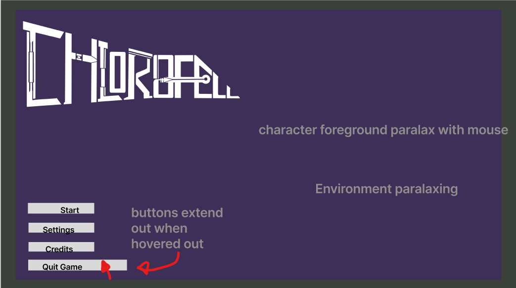
Main Menu End Result
My work on this main menu included implementation, feedback, and layout!
Game HUD - Reticle/Ammo
In this section, I will break down the reticle using the slides from the style guide!
Reticle/Ammo - Assets


From my mock-up in the Unity prototype, I identified the required assets and presented that information to the team.
Made sure to define and explain the design of the required assets.
Reticle/Ammo - States

Created a mind map to communicate different states visually to the programming team.
Set the framework for the UI mechanics via the mind map.
Programmers often used the guide to create the game's mechanics.
The team often used the mind map to understand how combat would progress in moment-to-moment gameplay.
Helped reinforce and determine the types of animations and signifier feedback that would be needed for the mechanic.
Reticle/Ammo - Art References

Initially, I settled on a crosshair/reticle reflecting the different ammunition types.
Purple: Explosive ammo
Blue: Shield ammo (same color as shield icon)
Green: Slow ammo
Worked with artists to develop the right-click icon in the reticle to signify which type of ammo the player would be switching to.
Worked with the UI artists to define the reload animations to signify success, failure, and normal reloading.
In-Game Footage
Prototype UI
Release UI
Ending Notes
Looking back, Chlorofell taught me as much about team communication as it did about design. Deciding to create a UI/UX style guide, something most teams skipped, turned out to be one of the best calls I made, keeping the visuals consistent and the whole team aligned throughout development. It also showed me that UI needs to make sense not just to players, but to the people building it too.
That said, splitting my time across production and level design meant I couldn't give the UI the attention it deserved, and getting into the custom engine later than I should have led to unnecessary crunch and less time to iterate. If I did it again, I'd prioritize getting into the tools earlier and establishing clearer cross-discipline check-ins from the start.
Check out my other project!