
ARK: Inventory Redesign
Role: UI Designer | Type of Project: Solo Project | Size: Independent | Duration: January 2024 - March 2024 | Software: Figma
Overview
Ark: Survival Evolved is one of my favorite survival games, but its inventory UI has always had issues with usability and readability. It leaves a lot to be desired, and I made it my goal to see if other people agreed with me and what I could do to improve it! I created a survey for the ARK community that got 38 responses and interviewed two lesser-experienced ARK players to find pain points with the UI and confirm my suspicions. I then completed several user tests with my redesigned wireframe to see if my improvements were effective. I gave my survey to veteran players and ran in-person gameplay tests under a rigid testing structure to see the disconnect between players of all experience levels and the UI.
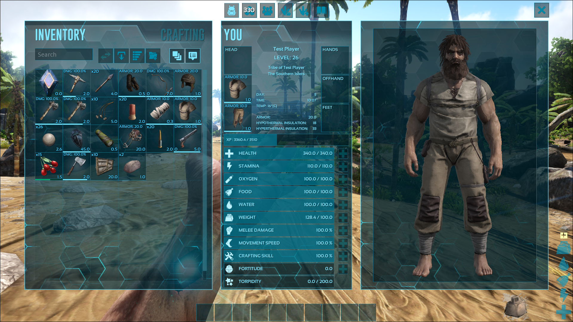
Original Game UI
Identifying Problems and Conducting Research
Conducted user interviews with less experienced players to discover pain points for new users.
Created a survey focused on veterans of the game to uncover issues that users have grown complacent with, forgotten, or that ultimately annoy players.
I posted the survey on ARK communities on Reddit and Discord that gathered 21 responses.
Parsed data and findings from interviews and surveys to find solutions and validate/invalidate my possible solutions.
User Interview Testing Methods
User Interview Findings
Survey Findings
Converting Problems to Solutions
Main Problem Statement
Redesign Ark Survival Evolved’s inventory UI to empower new
players to make full use of the tools available to them. Also to
support veteran players with quality-of-life features to minimize
frustration in-game.
User Stories
To better understand the problems I needed to solve and the users I was solving them for, I created user stories that captured their motivations and the reasons behind their desired changes.
(Hot Bar)As a new player trying to learn the game, I want to have my hot bar connected to my inventory, so that I don’t forget what items I have.
(Feedback) As a new player trying to learn the game, I want visual feedback to tell me when and where I can move items to learn how the inventory works.
Lack of organizational features
Cramped UI
Unclear which items are usable from the Hotbar
Unintuitive organization and sorting features
(Unaware of Inventory Tools) As a new player trying to learn the game, I want to know what tools I have available to maximize the use of my inventory and minimize frustration.
(Simple Organization) As a mastery-focused player, I want to be able to sort my items quickly so that I can organize and find the ones I need.
From Pain Points to Goals
Give users tools to organize items across various types easily.
Clearly define what can and cannot be used with the hot bar for players.
Develop new signifiers to streamline users' understanding.
Refining the Organizational Experience
Increasing Inventory UI Space
Problems:
In-game UI for inventory required the user to scroll if they had many items.
Elements were squashed together, and the UI felt cramped.
Solutions:
Consolidated the character view window and character stats.
Increased the size of the inventory space.

Sorting and Filtering
Problems:
Limited sorting options and irrelevant sorting options
No filtering options for items.
Solutions:
Added the ability to sort options by item type.
Added the ability to filter items by type.
Item and Hotbar Confusion
Problems:
No signifiers for where your items will be moved to when moving them in your inventory.
No signifiers that tell players what items can be used in the hotbar or offhand slot.
Solutions:
Added an arrow showing where the item would be placed in the inventory slots depending on where the player would put it.
I made the hotbar turn red, and the item and corresponding slot slowly blinked the same color.
Figma Prototype
Ending Notes
Learning Outcomes
The ARK project taught me that sometimes a clean, elegant fix is better than a complete UI overhaul.
It’s more important to reduce the rest of the team's workload while still solving the problems players encounter.
I learned that new users are often better at pointing out issues with a system because they're not used to its quirks yet.
On the other hand, long-time users got used to the UI and its flaws, so I had to dig deeper into their survey responses to uncover the pain points that still mattered to them.
What I Would Change
I felt like I delivered some elegant solutions in this project, but I could’ve pushed further in Figma to better show off the system’s potential.
I chose to demo the base functionality for a couple of elements instead of building out everything.
Looking back, I think I should’ve added more functionality to the Figma prototype to really highlight the changes and full feature set the system would offer.